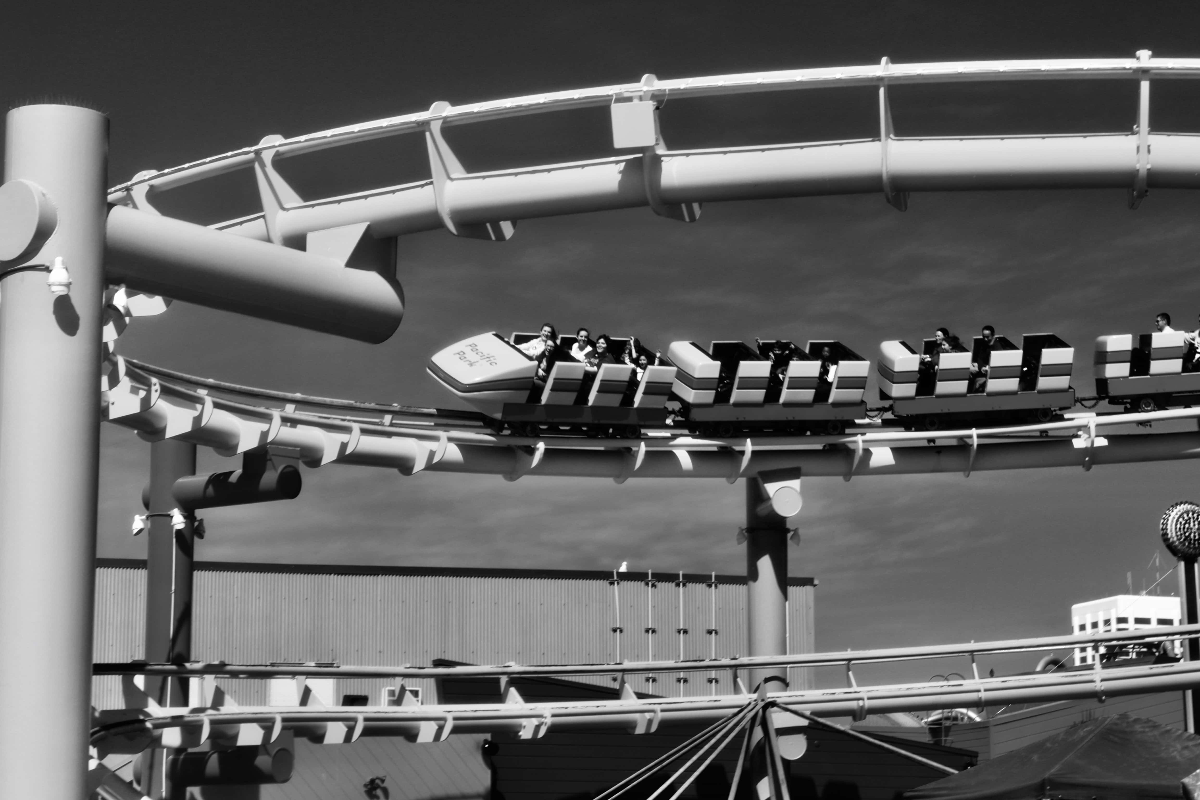
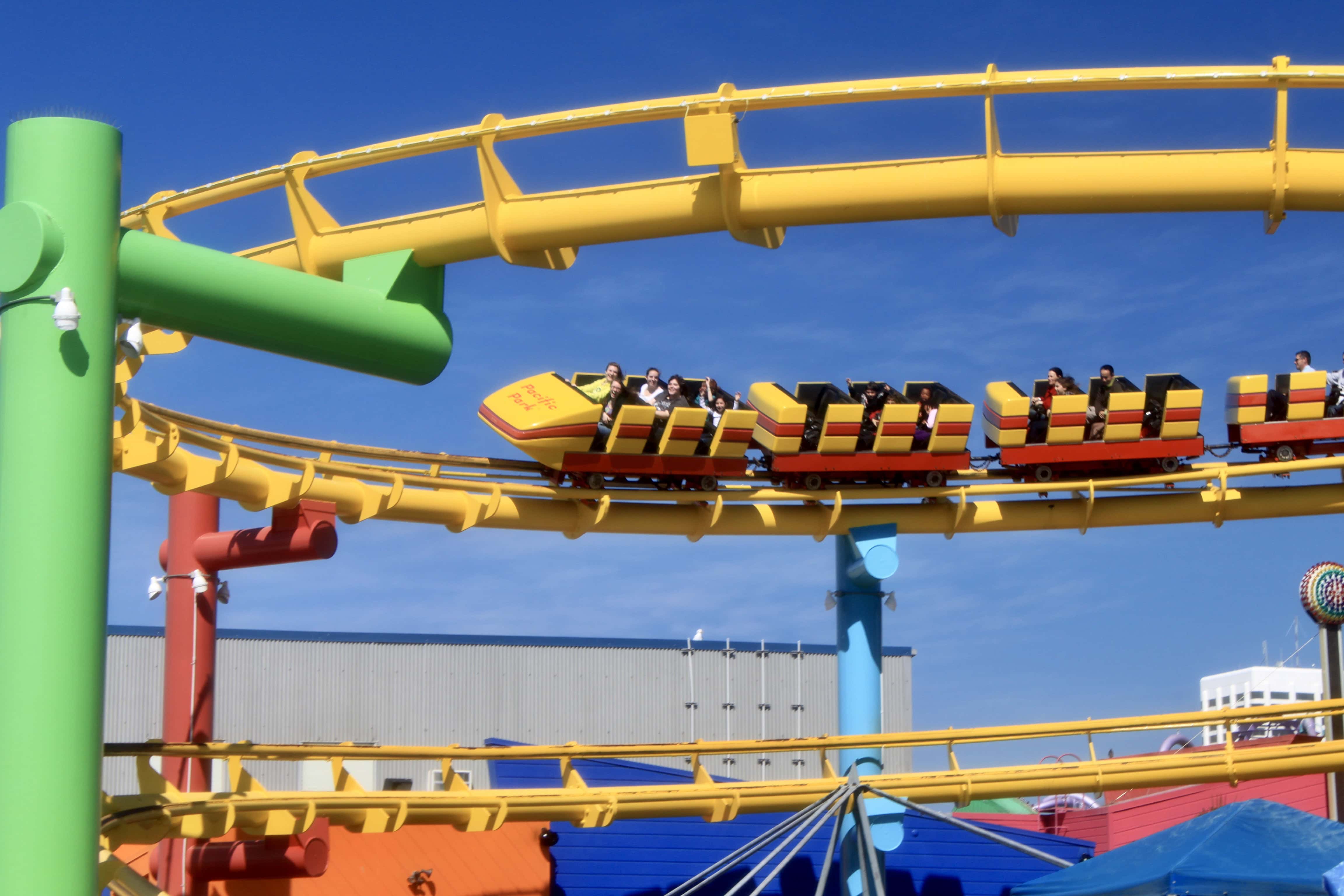
This week I’ve chosen a shot from Santa Monica Pier, CA. I usually put these pics up in full colour as they are so vibrant; but I thought I’d try monochrome to see how they turned out, and was surprised at how good they look. I’ve put in the original as well so that you can see the difference.
I'm a Royal Navy Veteran from Scotland and love to get out and about with my wife, susantbraithwaite.com, on our Kalkhoff e-bikes. My faithful camera, Snappy, and the ever-present Lensy (lensball) are always along for the ride to capture the beauty of Scotland đ´ó §ó ˘ó łó Łó ´ó ż. Join me as I share photos from our travels, how Lensy views the world & pretty much anything shiny â¨
View all posts by Photos by Jez
The colour gets the vote from me. But, you’re right, the monochrome is effective, too.
Yes, I like the monochrome too. It has such a different feel to it.
I love rides like that… Beautifully toned monochrome xx. Many thanks for entering the challenge xx
Thanks, Bren đ I love your challenge; it literally makes me look at photos in a whole new light.